Aliocha Oicle

EDCI 337

Assignment 4: Relieving stress

Goal:  Our goal is to provide learners with different methods for relieving stress in their everyday lives.

Learning Outcomes: By the end of this lesson, learners will gain knowledge on several simple and effective activities to do that will help them feel more relaxed. They will also understand the benefits of stress relief. More specifically, learners will be able to:

  • Understand the importance of stress relief
  • Practice meditation involving a focus on breathing
  • Have options for exercises that can relieve stress
  • Gain knowledge on tips for sleeping well
  • Know how journaling can help when overwhelmed

Prior knowledge:

  • It may be beneficial for learners to have a previous experience with meditation since the delivery of the content on meditation will not be extremely in-depth.
  • Anyone who is wanting a few tips on ways to reduce stress can watch our presentation as it intended for anyone to try.

Delivery:

  • Infographic created using Canva:
    • Five tips that can aid learners with meditation techniques
      1. Planning a time for meditation routine
      2. Sitting with good posture in a comfortable position
      3. Deep breathing
      4. Focus on breath and movement of breath in the body
      5. Be kind and note any distraction as a thought or feeling
    • Each of these tips will have corresponding images
  • Slideshow presentation with a narrated video
    • Information on why it’s good to relieve stress
    • How exercising, journaling, sleeping well and yoga will help reduce stress levels when practiced.

After creating this lesson plan, we began developing multimedia content to achieve our goal and learning outcomes.

First is the following infographic titled “Tips for Meditation”.

When creating this infographic, Beth kept the following multimedia learning principles in mind in order to effectively transfer knowledge.

  • Coherence principle – Each step in the infographic is fairly short and simple which will keep help maintain a low cognitive load.
  • Contiguity principle – Each step has corresponding and relevant images.
  • Segmenting principle – Breaking the information into five steps is helpful so learners can stop and reflect on what they have read.
  • Learner control principle – The infographic allows learners to read the information at their own pace.
  • Signaling principle – This principle is followed in the infographic because the numbered steps will help the reader easily understand the organization of essential material.

Then a slide presentation and video was created

As I created the slide presentation video I made sure to follow along with multimedia learning principles to ensure efficient learning outcomes. 

  • I made sure to make each slide’s information clear and simple as humans learn best when distracting material is not included. This followed the Coherence Principle.
  • I also made each slide title and key points obvious so that learners know exactly what to pay attention to. This followed the Signaling Principle. 
  • For the video narration process, I made sure not to put too much text on each slide and to add points as I talked. I did not want to overpower my presentation by adding a lot of text as well as narration. This followed the Redundancy Principle.

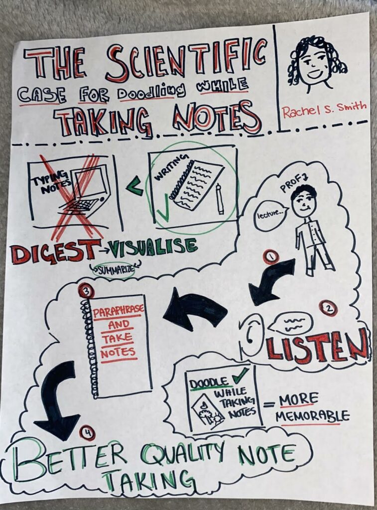
Updated Sketchnote Assignment

For my updated multimedia learning object, I decided to revisit my sketchnoting assignment. I chose to redo this particular sketch as I believe the organization and clarity of my work could have been done better. To start I made the title and objective of my sketch more clear by filling in the letters, this made the entire sketch seem more professional. I wanted my sketch to be educational and precise so I decided to sketch out the steps written by the Government of Canada on how to wash your hands. This topic is particularly important in the age of the COVID19 pandemic and I thought a quick step-by-step sketchnote would be appropriate to complete.

While sketching out the information provided in the article I made sure to follow the Coherence Principle by only writing/drawing out the important information. Only including simple text and simple visuals that relate directly to my learning topic helps the overall flow of my information. I also presented the information in segments by writing out 5 steps to follow along with. This uses the Segmenting Principle as peoplelearn best when information is presented in segments, rather than one long continuous stream. 

Overall I believe this sketchnote is much more straight forward and informative on what my chosen article is talking about.

Learning Pod Blog Post Feedback

I will be giving feedback on Beth Lewis’s blog post from topic 8. https://elizabethlewis.opened.ca/2021/03/13/ted-talk-through-a-critical-lens/

I thoroughly enjoyed Beth’s review of the Ted Talk  “How to come out at work, about anything | The Way We Work, a TED series”. I like the connection made from to video to the Personalization Principle and Voice principle as these are multimedia learning principles that I have not thought of using yet. I too agree that the dual coding theory is correctly used in the Ted Talk and definitely enhances the learning outcomes. As her blog post mentions The Coherence Principle could have been used more effectively in the Ted Talk. I like the way Beth specifically points out the unnecessary addition of the clicking sound effect as this shows propper knowledge about the learning principle and gives the reader a clear example of what she means. I wonder if maybe the blog post could have used a small summary of the Ted Talks main points, but overall the use of the learning theories and learning principles make for a great analysis of the video. The formatting of the blog post is clear and all the key points of the video analysis are separated into sections which make for a great read!

Blog Post 9

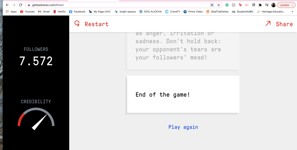
In the Bad News interactive game, I ended up with a score of 7,527 followers. I thought the game was a little confusing at first. Once I got the point of the game and what it was trying to accomplish, I found the process quite entertaining. If I were to improve the game in any way it would be to give a short explanation of what the intent of the game is because I didn’t exactly understand that I was aiming to grow my following right away. As for the multiple media learning principles that it followed, I believe the game used the spatial contiguity principle well. The space in between the texts and visuals on the screen were beside each other which grouped all the relevant information together. This made it easier for me to follow along to and process all the information. The game did not follow the signaling principle as it wasn’t extremely clear what to pay attention to on-screen. There was a lot going on with lots of changing information.

For my sketchnote assignment, I tried to group together the key elements of the article we were sketching. Doing so followed the coherence principle as I left out the distracting and irrelevant information from the article that did not need to be included. Sketchnoting is definitely a helpful thing to do in school as it forces you to summarize and visualize what you are reading. Physically putting information down on paper will activate your brain and speed up the learning process.

In EDCI 337 we constantly follow short demonstrations followed by class discussions. We also work on group projects and do peer reviews for our blog feedback assignments. These are all examples of active learning methods.

Sketchnoting assignment
Bad News game

Blog Post 8

For my video I wanted to make sure to follow David Phillips 6 dos and don’ts on PowerPoint presentations. I also followed a few of the multimedia learning principles to ensure my presentation was clear and easily understood.

  • For my presentation I made sure not to put too much text on each slide. I also made sure not to read directly off the slides. I did not want to overpower my presentation by adding a lot of text accompanied by a long narration. This followed the Redundancy Principle.
  • I also put up a pictures of Simone Biles with short key point text on the side and followed along with narration. This followed the Multimedia & Modality Principles.
  • I then made sure to make the title of each slide the main prominent point of my discussion so that listeners knew what I was going to be talking about. This followed the Signalling Principle.
  • I used Ariel font for my text as David Phillips states it is the easiest font to read and follow along to.

Blog Post 7

For this week’s activity, we were asked to create a twine story.  Twine storytelling embodies a few of the multimedia learning principles that we have learnt in class. The first one I can relate to my interactive story is the Segmenting Principle which states that we learn best when information is presented in segments rather than one continuous stream. This is evident in my story as each part of the story is separated into small text. It is not a long paragraph style of writing. Another multimedia learning principle that I can relate to this storytelling activity is the Personalization Principle. This principle states that we learn best with an informal style of explanation rather than strictly formal. This is evident in my story as I made the writing style personal and easy to follow along to.

A twine story is a great method of education as it keeps readers engaged in the development of the story. Paying attention is important in all aspects of learning. Being able to follow along and get to the final conclusion of a story is beneficial to all learners. Providing education through stories can improve curiosity, imagination, and communication. Reading to someone can increase their willingness to express themselves and communicate their thoughts and feelings. You can use a Twine story for instructional purposes by assigning a story and asking follow-up questions to spark general conversation.

Optional Topic 6 Blog Post

For this blog post, I decided to create a poster through Canva. A few of the multimedia learning principles can directly apply to the way I made and edited my poster.  The first being the Coherence Principle. I followed this principle by not adding extra details to the poster. The date and time were made very clear which made it less distracting and straightforward. As the Coherence Principle embodies, humans learn best when distracting materials are not included. The next principle which can relate to the making of my poster would be the Signaling Principle, which essentially means that we learn best when shown exactly what to pay attention to. This is evident in the poster making as I kept the information very clear so that you know exactly what to look at and how to take in the information.  The Spatial Contiguity Principle is also applicable to my poster as I kept the important information close together so that it’s easily read and understood by the viewer. All and all the creation of this poster was fun and easy to understand. I’m happy I now know of the website Canva and if I ever need a place to create a poster I know where to go.

Poster design (1)

Updated Screencast Video

For my updated multimedia learning object assignment, I decided to revisit my screencast video demonstration. I found my first screencast video to be a little messy and unorganized as I wasn’t very familiar with the recording and editing process. I believe I’ve upgraded my recording skills and created a much smoother video demonstration. I made sure to take my time explaining the content and wanted to ensure I was properly showing the correct steps. In order to make my screencast video more effective, I recorded myself showing the steps in shorter videos and merged them all together in the editing process. This made me less nervous about messing up as it was not all in one take. Once I put all the steps together, the video was easier to understand and simpler to follow along with.  I wanted to focus on the multimedia principles when revisiting my screencast video to make sure I was creating an inviting learning environment for viewers. I focused on the Temporal Contiguity Principle by making sure my words were corresponding with the visuals on screen. I also made sure to not speak too fast and to enunciate as much as I could. The Temporal Contiguity Principle revolves around the teaching of a new process and states that humans learn best when the visuals occur at the same time as the voiceover audio. This is something I made sure to follow when updating my video. Another multimedia learning principle I wanted to follow this time around was the Segmenting Principle. The Segmenting Principle states that we learn best when information is presented in segments. As I mentioned before I broke down my explanation into different parts to make the lesson flow better. I added a voice recording at the start to overview what I was going to be demonstrating to make sure I wasn’t jumping into it too fast. I also broke up the first downloading process and the final posting of the image into 2 sections by inserting a title box between them. This made the lesson less fast pace and showed that there were 2 separate parts to my demonstration.

Learning Pod Blog Post Feedback #2

I will be providing some feedback on Cory Rausch’s blog post from the dual coding and learning week. I like how the post starts off by explaining a personal view of his own past presentations. This shows that this week’s lesson was properly understood and positive changes to presentations will likely be made in the future. I also like the connection between playing guitar and being transported and how learning environments can benefit from it. I wonder if the blog post could have gone a bit more into detail about Flow in the Khare (2018) reading. As someone who did not complete this week’s post may not understand what was taken from the article. Overall this blog post is fun to read as it is filled with personal connections and experiences.

Learning Pod Blog Post Feedback #1

I will be giving feedback on Elizabeth Lewis’s Multimedia Lesson Plans & Interactive Video blog post. This post explained the importance of a lesson plan well and provided me with its key components which I enjoyed. The description of the lesson plan was straight forward which made the explanation very easy to understand. I also liked the way that each multimedia principle was in point form so that readers know the premise of each principle well. I wonder if there may be a slight problem with the embedded video as it would not allow me to watch it through and would pause sometimes for a long time. All and all I really liked the style of writing that this blog post offered and the key topics for this week we’re definitely met!

« Older posts

© 2024 Aliocha Oicle

Theme by Anders NorenUp ↑